
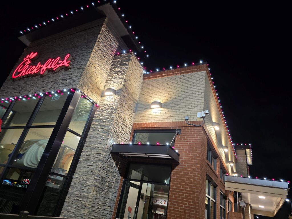
Make Your Storefront Stop traffic After Dark
Good storefront lighting can be the difference between people walking past your shop or walking in. After sunset, two stores can sit side by side on a Kenosha street, selling similar products, but only one will grab attention. It is almost always the one with bright, clear, well-aimed lighting that makes everything inside look sharp and easy to see.
Strategic lighting makes products look more desirable, windows more eye-catching, and signs easier to read from the street or parking lot. It is not just about having enough light. The quality and placement of that light changes how your colors, textures, and displays actually look.
There are three simple “C’s” that have a big impact on how your storefront feels after dark: color temperature, CRI, and contrast. When you get those right, even plain products can look more premium and your windows keep working for you long after you lock the door. As a local outdoor lighting company serving Kenosha and Southeast Wisconsin, we see how much difference the right lighting makes for commercial spaces of all kinds.
Why Color Temperature Makes or Breaks Product Appeal
Color temperature is how “warm” or “cool” a light looks, measured in Kelvin. Warm light has more of a yellow or amber glow, like a cozy lamp. Cool light leans more white or slightly blue, like bright daylight. That simple shift changes the entire mood of your storefront.
Here is a quick guide for retail:
- 2700K to 3000K: Warm and cozy. Great for boutiques, handmade goods, specialty foods, and spaces where you want people to slow down and relax.
- 3000K to 3500K: Comfortable but clear. A solid middle ground for general retail that needs both warmth and accurate color.
- 3500K to 4000K: Clean and crisp. Works well for tech, sporting goods, modern brands, and any store that wants a bright, sharp feel.
Using the wrong color temperature can send mixed signals. For example, very cool light in a cozy gift shop can make wood and fabrics feel cold and flat. Warm light in a high-tech showroom can make white products look a little dingy or yellow.
A bigger problem is mixing different color temperatures in one storefront. When half your fixtures are warm and half are cool, you might see:
- Clothing that looks one color in the window and another color inside
- Shelves that feel patchy or cheap, even if the products are high-quality
- Brand colors that look “off” or inconsistent from sign to sign
In a place like Kenosha, with long fall and winter evenings and bright snow, color temperature also ties into comfort. Slightly warmer light during those months can feel more inviting and can soften harsh reflections. In spring and summer, a neutral white range often feels fresh and clear without being too harsh.
How High CRI Lighting Makes Your Products Look Premium
CRI, or Color Rendering Index, tells you how well a light source shows the real colors of your products compared to natural daylight. The scale goes up to 100. The higher the number, the more accurate and rich the colors will look.
General ranges work like this:
- CRI 80: Common in many basic fixtures. It is acceptable, but colors can look a bit dull. Fabrics, cosmetics, and food items may not “pop.”
- CRI 90 and above: Much better for apparel, jewelry, cosmetics, specialty foods, artwork, and any product where subtle color differences matter.
With low CRI lighting, reds can lean brown, blues can look muddy, and skin tones in mirrors or fitting areas can appear strange. High CRI lighting helps:
- Customers judge fit, color, and finish more accurately
- Reducing surprises when shoppers step outside with their purchase
- Make materials like wood grain, leather, metal, and glass look richer
For commercial lighting in Kenosha, the real secret is pairing high CRI with the right color temperature. That way, whites do not turn yellow or bluish, and your brand colors stay true across signs, displays, and packaging. Good lighting should support your brand, not fight it.
Using Contrast and Layering to Guide Shoppers’ Eyes
Brightness alone will not make your storefront stand out. What grabs attention is contrast, the difference between light and dark. When certain areas are a bit brighter than others, your eye is naturally pulled to them. That is what makes a window display stand out across a parking lot.
Effective retail lighting usually uses three layers:
- Ambient lighting: The general background light that makes the space feel safe and comfortable.
- Accent lighting: Focused fixtures that highlight window displays, feature tables, mannequins, or endcaps.
- Task lighting: Brighter, targeted light over checkout counters, fitting rooms, and service desks.
Some simple tactics for better contrast:
- Make high-margin or seasonal displays brighter than the background so they become the natural focal point.
- Keep ambient lighting at a comfortable level, not so bright that everything looks flat.
- Use directional fixtures or track heads so you can aim light at products instead of at people’s eyes or reflective glass.
Common issues we see include:
- Flat, uniform brightness where nothing stands out and the space feels bland
- Spotlights that are too harsh, creating sharp shadows or blinding glare
- Fixtures aimed wrong, shining on the sidewalk or ceiling instead of the merchandise
Thoughtful contrast and layering make your storefront feel planned and professional, not like a random mix of bulbs.
Storefront Strategies for Kenosha’s Seasons and Streetscape
Kenosha’s location near Lake Michigan brings changing light and weather. Early winter sunsets, gray skies, and snow all shift how your storefront lighting looks from the street. Your goal is a storefront that works in bright sun, twilight, and deep evening.
For windows and facades, consider:
- Keeping window displays slightly brighter than the interior so they read as a “stage” from outside
- Avoiding harsh glare on glass, which can block views into the store
- Adding vertical light on doorways, columns, and signage so entrances feel obvious and safe
Seasonal adjustments can help too:
- Fall and winter: Slightly warmer tones and higher brightness outdoors can cut through early dusk and snow reflection and make the store feel welcoming.
- Holiday season: Decorative and permanent roofline lighting can frame the building, but it should not wash out your window displays or clash with your brand colors.
- Spring and summer: With more natural light, a neutral white range and slightly lower intensity can keep the store feeling fresh and comfortable.
It also helps to think beyond the glass. Parking areas, walkways, and building exteriors are part of the same experience. When those areas have clear, consistent lighting, the path from car to door to checkout feels safe, easy to follow, and on-brand.
Light Your Kenosha Storefront Like a Pro
Color temperature, CRI, and contrast work together like a silent sales team. When they are balanced, your products look better, your brand feels stronger, and your storefront pulls people in long after the sun goes down.
A simple lighting check can reveal a lot. Walk outside at dusk and ask:
- Do any fixtures look a different color than the others?
- Are your best displays actually the brightest spots in view?
- Is the entrance clearly lit and inviting?
- Do colors on key products and signs look true and consistent?
If the answer to any of those is no, it might be time to rethink your lighting approach. With the right plan, your storefront becomes more than just a glass wall. It becomes a 24/7 visual display that works for your business every evening.
Get Started With Your Project Today
If you are ready to upgrade your property, we can design and install commercial lighting in Kenosha that fits your goals, timeline, and budget. At Rocket Lighting, we listen to what your business needs, then recommend practical solutions that improve safety, efficiency, and appearance. Reach out and let us walk you through options, next steps, and straightforward pricing. If you have questions or want to book a consultation, simply contact us.